Sunday 29 December 2013

Leave the Thesis Statement for Last

The way I see it, writing a thesis isn't that much different to writing a book.

You have something you'd like to tell, one thing you discovered in your research about your field that you wanted to share. A lot of times, when it comes to writing the thesis, you open MS Word and as soon as you see that empty page, your mind goes blank. Why? Because you need to write the introduction. And that introduction includes the thesis statement.

Contrary to what you might think, the thesis statement is probably one of the hardest things to write. It usually appears at the very beginning of your thesis, and it's supposed to tell your reader, in one sentence, what the rest of the 80-page thesis is all about. A one-sentence summary of sorts.


So let's look at what a thesis statement is first before we look into how to write it:

  1. It's a specific statement that tells readers what the thesis is about
  2. It directly answers the problem statement that is addressed in the whole thesis.
  3. It presents a claim that others might argue against.
There are a lot of ways to write thesis statements. Indeed, if you Google 'THESIS STATEMENT', there are loads of tips on how to write it properly. There is, however, one secret that I'll share with you on writing a thesis statement.

The first one you draft isn't going to be the perfect one. In fact, leaving the introduction for last is probably your best bet.

I know, I know. Many of you will probably argue with this, but for me, this rings true not just for thesis statements, but for any essay, academic paper, or novel/short stories that I write. Introductions are super hard to write because they're supposed to summarise what's coming next. And how are you supposed to summarise what's coming next if that part isn't even written yet?

There is nothing - I repeat, NOTHING - wrong with writing your introduction and thesis statement last. Even if you do write it at the beginning, there's a high chance you'll end up going back to it and editing it later - which is also okay. The bottom line is to know what a thesis statement is and what it's supposed to do.

By the time you write the conclusion to your thesis, you're probably enough of an expert to be able to write your thesis statement in just one sentence. And that's what ultimately what we want, right?

Writers do this all the time. They start their books at the second or third chapter, or even the middle of the book, and they go back later to write the introduction. It gives more of a kick, like starting a story and knowing already how it ends. You know then how to draw your readers in, what to say to make them intrigued to read on. 

Your thesis means something. It has discovered something others haven't, even if it's something small.

In this sense, your thesis statement should do the thesis justice. The final touches are always to make something precious look even more appealing. I'd say, go for making that thesis statement as the final touch to your thesis.


Friday 27 December 2013

MEET NOIR! The levels of data!

Today will introduce to you the levels of measurements in the data. The ability to identify these types of data is important because most statistical tests requires a certain type of data.


OK. What does NOIR stands for? Nominal, Ordinal, Interval, Ratio

1: Nominal


Nominal is the lowest level of data. It can only classify data into groups, and there is no difference between these categories. Some examples are:

Gender

Race
Nationality

As we can see in these examples, there is no way to decide which of these attributes are better than the other. As a researcher, try to collect these types of data only when necessary because you can only calculate COUNTS and MODE only.


2: ORDINAL
Ordinal is the 2nd tier. Better than Nominal but not the best. Ordinal data is still categorical, but you can know which is better. An example is:

LEAGUE TABLES:

This case we can see that  Arsenal is 1st place, Man city 2nd and so on. By looking at the position only we do not know but how much is Arsenal ahead. But when looking at this:


We can see that Arsenal is 1 point more than Man City, the PTS is at Interval scale. (More on this later)
Other Examples are:


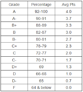
Grades:

Travel Class:

Thats enough for ordinal :)

3: Interval
Interval is the 2nd best level of measurement. We can tell which is better and by how much. however the limitations is that you cannot perform mathematical calculations with it. Examples are:

Scores:


We can see the Vikings are at 14 and the wildcats are at 7. However we cannot say that Vikings are 2 times better than Wildcats. The score is just an indication who is better.

CGPA:

Here if the person gets a C will get 2.0 and the person whom gets A will have a score of 4.0. but we cannot say the person with 4.0 is 2 ties better than 2.0.. see?

Likert Scale:


Eventhough some say the likert scale is Ratio, i would strongly stand to say that it is interval. however there are exceptions, like if you take the average of multiple likert scales, it can be a ratio.

4: Ratio
Ratio is the best type of data, you can do lots of things with this type. You have high flexibility and you are able to transform it into the other 3 levels (Yes, you can downgrade it) Examples are:

Height:

Height, in numerical value such as centimeters or millimeters, can be manipulated mathematically. An individual with the height of 2meters is 2 times higher than 1 meters.

Speed:

Salary:

For these 2 examples, im sure you understand why they are ratio level :)

Thanks! thats it for today! if you need us to help you analyse, drop us a message!

Saturday 21 December 2013

Spark up you slides! Hints on better and more interesting slides!

Hi Everyone, today i will share with you some of the common mistakes people do in their slides, and solutions to them.

Eventually everyone has to do a presentation. HOW you present it matters more than WHAT you present. The main objective is to deliver your message, not bore people to death!


FIRST TIP: Make sure your background makes reading EASIER, not harder:

This is obvious, but many people seem to overlook at this. most people wants to be toooooooo fancy they spoil the slides. Please use a simple background instead a very messy 1:

Examples: See for yourself, which is easier to read?

FIRST:


SECOND:


I would say the second slide is better. make sure they can see the things that you actually want to show :)

SECOND TIP: Talk more, Read LESS

From my observation, the majority tend to read from the slides. Most listeners would say that is not a presentation. They themselves can read! Why are you reading it for them?

Example:

FIRST:

SECOND:


The second slide does take more time to do, but it will attract the attention of the audience better than the first. Am i correct? Use the pictures as reminders for you to explain your story. This is much better than reading word by word...

THIRD TIP: 40-50 slides? Please, this is not a torturing game!


I have seen some slides go up to 60 slides. What a loong, booring presentation! Try your best to keep it at a maximum of 20 slides. Here is some tips how:


    1. Use pictures: there is a famous saying "A picture is a thousand words"
    2. Use Animation: this is a great feature that you can use to make multiple layers out of one set
    3. Put the things that are essential and relevant.


Thats about it for today i guess. i thought i had more advice than this, but im pretty sure these are the most important things to take into account. if you are not sure of anything, for a reasonable fee i can make good slides for you. Thanks!


Wednesday 18 December 2013

What to do when you are stuck in the middle of your thesis?

Deadlines coming soon? You have no idea how to analyse something? Or maybe its just there is too many things to do but there isn't enough time?


YOU ARE NOT ALONE
Why? Because life is not perfect, no project is perfect ^.^

So then how do you get out of this mess? Today I will share with you some ideas some ways to resolve this problem:

The First Step is to identify your problem. What made you stuck in the first place? it could be one of these things:

  • Dont know how to do it
  • The data you collected does not turn to be what you hoped it to be
  • OR maybe its just that you are simply lazy :)
OK now you know whats your problem. Whats next?
Ok, Lets take the first scenario "I dont know how to do it" here is some approaches on how to resolve this:
  1. Ask for help from your friends. Yes! it is obvious indeed. Once you are stuck and you know you wont make any progress, now is the time to get assistance. You can go and find a colleague that may give some advice and guide you the way
  2. Meet a lecturer. This does not have to be your supervisor, it can be another lecturer too! Lecturers are humans too you see, some other lecturers can point out different approaches to solve your problem. and their solution might be better than your supervisor :)
  3. Google or Youtube it. To me, Youtube has become a library of knowledge. Sometimes if you dont know how to create an ANNOVA table using SPSS, most likely there will be a video in Youtube that will show you step by step!
  4. Find a Consultant. This option may cost you some money, but you are hiring someone that knows what he does, he will do all the thinking for you. As for me, I usually ask my customers what are they stuck with, and i do that part for them, then i teach them what I did in order that they understand more about their thesis.

"I know what to do, but my data seems to be my enemy! So HOW?"
This can be a very unpleasant thing to face. You have spent a lot of money and time to collect the data, but in the end the data may be unrealiable, or maybe it just does not support your hypothesis. Im afraid this happens quite often. So what can you do to save your thesis?

  1. Redefine your objectives. Try have a look again. Are your objectives realistic? Are they too ambitious? Or maybe the questionnaire you made didnt really achieve what you intended to.
  2. Transform your data. Some mathematical manipulations can be your lifesaver. You could decide to add some weighting to your data. If you need help with this, do drop me a message, i can help you out.
  3. Get more data. Sometimes a sample of 20-40 is too small. You dont get adequate information from such small samples. Try increase that amount, you may get more information.
  4. Redo your questionnaire. This is your last resort. If your first questionnaire is absolute rubbish. you might need someone to make one for you. For a very low price, I can help you construct a questionnaire in a few hours.
"What if im too lazy? or i wasted too much time and I am starting in the last minute?


Ok this is entirely your fault. If you are in this position you have very few options:
  1. Try your best and do what you can. If I was in this position, i would just do what i can to get the bare minimun: A PASS.
  2.  Get a consultant to do it for you. This will cost you alot alot alot of money. Like me i have do do a thesis for them, not just that, i have to teach bit by bit on what it is about so they can understand about their thesis. This costs alot of money since it takes alot of effort and time,
  3. See you next semester! This time dont procrastinate! Im sure you understand what i mean.
Ok thats about it for today. I hope this helps you in your journey. Need any extra help do drop me an email or you can phone me. Thanks for your time!


Monday 16 December 2013

Conditional Formatting... Simple Tools.. Helpful Results

Today we will share with you some tips on how to use Excel's Conditional Formatting. This tool is very useful when you want to find specific information from a LOOONG List of stuff!


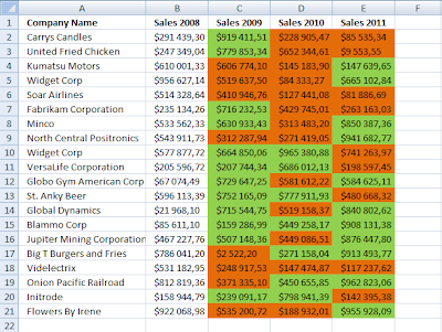
It is really quick and easy. the first step is to highlight what do you want to search. Example: I have a list of staff and the number of sales this month:

And i want to find which staff has reached this months target, lets say that the target is 300.

STEP 1: Select the data: Just simply select the data (in this case the sales column)

STEP 2: Go to Home, then select "Conditional Formatting":

This time i want to use "Highlight Cell Rules" to find which staff has more than 300 sales.

STEP 3: Choose "Greater Than":
STEP 4: A box will pop up, insert the value (which is 300 for this example):

Then choose any color that meets your taste, then click OK. As a result you will see:

Here we can see staff number 6, 13 and 18 has reached the target!

There are many other things you can do with conditional formatting, you just have to simply explore!

Here is a short list on what other functions it has:
  1. LESS THAN: Highlights Cells that are less than X
  2. BETWEEN: Highlights Cells that are between X and Y
  3. EQUAL: Highlights Cells that are equal to X
  4. TEXT THAT CONTAINS: Highlights cells that has a specified letter, word, or a sentence.
Theres many more! you can even try the top/bottom rules aswell.

Have fun! I hope this is useful.

Want to learn more about Excel, SPSS or Statistical Analysis? Contact us today!


Saturday 14 December 2013

GOOD VS EVIL CHARTS: Basic Guides To Effective Charting in Excel

Almost in any job that uses a computer must use Excel. From Excel you might have to prepare a presentation and make charts to show something to your boss. Today we will share some tips on types of charts in Excel and how to use them effectively!


First and foremost i would highly recommend using Excel instead of SPSS because excel charts looks better and is easier to edit.

Column Charts

  • These charts are the most commonly used when representing data
  • It is easy to read and understand
  • it is usually used to compare discrete items
A good bar chart is easy to read and understand. It is good to use alot of colours to make it visually attractive.

A Common Mistake: Most people try to fit a huge number of bars into one single chart. Some suggestions is to use 2 charts, or group similar classes together. This example uses only one colour, is pretty cluttered. The axis should be from 0 to 100 (since maximum is 100) the vertical axis is also missing.


A better way is using multiple colours, resizing the chart, or you could group columns together into group (however this will lose detailed information)


Bar Charts

  • This is the same as column charts, but they are rotated 90 degrees.
  • Suitable for charts with long labels


Line Charts
  • Useful to show trends and for time series data.
  • It is highly recommended that the points between the data are EQUAL

Pie Charts
  • Shows proportion.
  • Maximum 5-7 Slices. Too many will make it hard to read.

Scatter Plot
  • Is very useful to show relationships between variables.
  • Also ideal to display dispersion.
  • 1 dot = 1 data

 Well, Thats about it. These are just basic info on how to make simple and easy to chew charts. For more info, or if you want to learn more about charts. Feel free to contact us! This is a very valuable skill!

The TEAM

Today we would like to introduce the talents in our small merry band. Here is a brief portfolio of our team:


Name: Hamka Bin Mohd Noor
Qualification: Bachelor’s Degree (Hons) in Science Statistics

Graduation: 11/13

Relevant Experience:
  •  Enumerator for Lembaga Zakat Selangor (LZS) in 2012 and 2013. Conducted face-to-face and phone interviews with a wide spectrum of people.
  • IMPAK UiTM &Kementerian Pengajian Tinggi (KPT) (2013) Conducted research proposals, design questionnaires, questionnaires distribution, data entry and analysis, and full presentation on the findings
  • Has been a consultant for many students in many fields, from Diplomas to PHD. Has a wealth of experience in using various statistical tools.
Specialties: SPSS, C++ Programming, SAS Programming, Microsoft Office, Data analysis,


Name: Maisarah Ahmad Kamil
Qualification: Applied Language Studies (Hons.) English for Professional Communication

Graduation: July 2013

Relevant experience:
  • Second Vice-President, Tunku Scholars Association Malaysia (TSAM)
  • Webmaster (Yayasan Tunku Abdul Rahman)
  • Freelance writer, editor, proofreader
  • Currently a training consultant for soft skills.
Specialities:

1) Language (English): Copywriting, Editing, Proofreading
2) Communication: Presentation coaching, Public Speaking, Communication coaching (speaking, listening, writing)
3) IT: MS Office Applications (Word/Excel/Powerpoint/Access), Adobe Photoshop, Adobe Dreanweaver, Adobe Director, Swishmax


Name: Munir Bin Ahmad Kamil
Qualification: Bachelor’s Degree (Hons) in Science Statistics

Graduation: 11/13

Relevant Experience:
  • TELEKOM MALAYSIA (2012): Data Analyst
  • Freelance Research consultant for almost 2 years and still going
  • Currently a data analyst at a medical market research company.
Specialties: SPSS, Excel, Presentations, Proofreading, Data analysis, Questionnaire building, Conducting interviews.